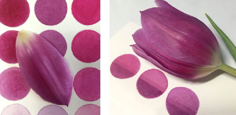
For decades I’ve taught accurate colour matching, first in an industrial setting to the staff of printing companies and, more recently in the past almost twenty years, to botanical artists. And in all these colour-focused years I’ve learned a key truth about people and colour; colour is always subjective and often controversial. In many cases, intensely so!
And the subjective aspect is fine and to be expected. Colour readily evokes energy and emotion in all of us. After all, we have our colour favorites in our clothes, our possessions, and even our cars. And therefore, not surprisingly, in what we choose to use as botanical artists.
The first thing I tell both aspiring and experienced botanical artists is that there are no “rules”. There are however plenty of theories. In this regard you can start with Sir Isaac Newton’s colour spectrum and continue all the way to contemporary times heavily influenced by the digital era. So where do you turn to for guidance in botanical art colours?
My answer is always to start by looking inward to decide for yourself what works for you in your own unique environment. Refine and limit your choices to a working, though not overly-restrictive palette, after understanding some basic technical facts. You need to know about the pigment content, the degree of opacity and transparency, colour shifts, and toxicity, to name just a few.
Seek these facts from reliable sources—not from the personal choices of other artists or artists-turned-teachers. These vary from artist to artist and even from teacher to teacher. Stop buying colours just because well-known artists use them. I suggest that you review your colour palette with you in mind. One artist who followed my suggestion found that she had 65 tubes of different colours collected over years of attending classes and conferences! By way of comparison, I have about 15 in my palette.
When you’ve decided on a palette that works for you, develop a working colour memory that removes colour choice confusion. Gain success through clarity, your way. You are as entitled to be subjective about your botanical art colour choices as the next artist. But expect to review and refine your colour choices from time to time as colour technology evolves.
Are the technical facts I mentioned above readily available? Yes indeed. You need to know how and where to find them. It’s not hard in this digital era. I like to offer artists reliable references without my own personal choices getting in the way. In spite of that though, artists often ask for my palette preferences. To that end I readily share in workshops and e-booklets what I use in my own practice. However, I always caution that my personal palette will be provided with a date as colour technology continues to evolve.
That brings me to the controversial aspect of botanical art colour choices. When it comes to choosing a palette for watercolour, things can become surprisingly heated. It’s not difficult to raise the hackles of some teachers and artists about the colour choices and theories they choose to adopt. I know it sounds silly, but it’s real. It’s so real that I have been blocked by some well-known botanical artists on social media over this very topic! One artist has gone so far as to block me from viewing her website. Until very recently I didn’t even know that this was possible! I’m more surprised and amused than bothered. As I noted at the beginning, some artists are intensely protective of their colour choices—some apparently to the point of paranoia.
My next e-booklet, Picking a Palette, will soon be in the bookstore on this site. It aims to remove some of the crazy myths and misinformation about botanical art colours. It will present you with facts, options, and ways to test pigment. I want to make sure that you go down a path that will take you to good choices for you.

