
Some of what you’ll see about botanical art on social media can be misleading or confusing. Most of the time I ignore it. Recently, however, a post about colour crossed a line. It was time to correct a few misconceptions and share some important colour information.
I was astonished at how much interest and how many supportive comments my post on Instagram drew. I decided that I had to repeat it here, albeit slightly shortened and edited.
“Time to SHARE a few things and correct some inaccurate perceptions. I am not known for brevity so will break this up over a few IG postings.
Let me start by asking if you have colour memory? Is it important for a botanical artist to have colour memory? I believe it is and therefore it’s a core element in what I teach about colour. The great Ferdinand Bauer(and his brother Franz) had finely-tuned colour memory and, contrary to many recent theories, did not work with colour charts past their early learning years with Father Boccius. The full story is a topic for a post of its own though.
Do I require artists who study with me to paint colour charts? Heck no . . . I find them seriously boring personally but I fully respect the choice of many teachers who do choose to use them when teaching beginners how to blend different pigments. There are also multiple other ways to help beginners and even intermediate artists understand colour better. And indeed there are no books of rules for colour instruction . . . well none that I know about.
One of the main reasons I do not use colour charts is because they are laborious and typically show the blending of two (or more pigments) in a single wash. In botanical art very little is expressed in a single painted layer—brilliance of colour as well as subtle value transition always involve more than one wash.
So what are these circles of colour I often share on social media? Well for a start they are not colour-in or stay-inside-the-lines-exercises as suggested by some, though perhaps they could be useful for exercises in tighter brush control for newcomers. Instead, they are in fact my own personal method developed for testing watercolour pigment and helping artists develop their own working palette. (I never impose my own palette).
And yes, I do use these colour tests to help an artist develop colour memory; acquiring colour memory is incredibly useful and empowering for those new to the world of art and colour. I have proven over and over for more than thirty years that (excluding victims of colour blindness) anybody can reach a point of utilizing colour memory effectively.
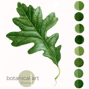
Shown here is my oak leaf some of you will recognize from the ASBA tutorial book Botanical Art Techniques. I did not mean this leaf to be a framed piece of art, although some students have offered to buy it. Instead, I used it in my teaching in a series of workshops on the colour GREEN and painting leaves.
I enjoy demonstrating how to closely match a natural green using at least three completely different pigment combinations. Of course the usual blue and yellow options and yes—gasp!—green pigment too! I know many superb and acclaimed artists who use “convenient” green paints and have never suffered reputation loss because of it. But knowing how to “tame” a transparent permanent green paint into a natural range is very important.
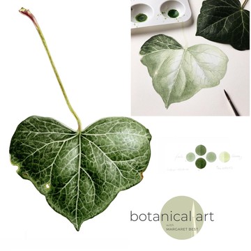
I am also including the ivy leaf painted by the wonderful artist, Florence Gendre, at the workshop I taught in France to a great group of artists hosted by Agathe Haevermans.
By the way, I do love both the visual beauty and the learning opportunity provided by a single flat leaf. It seems that the great Rory McEwen did too, as does Asuka Hiskihiki. I love her salad leaves!”