Fugitive watercolour pigments (those are the ones that can change colour or even fade away completely) can be very seductive. Some are easy to fall in love with. Take Opera Rose, for example. It came up on a social media post this past week and since discussion on colour choices can lead to some nasty interactions and pointless arguments, I usually don’t comment.
However, on this occasion, I just had to stick my oar in. The host of the page in question suggested that the way to get around the fugitive nature of the lovely Opera Rose was to mix it with a non-fugitive pigment and it would then have a better chance of survival.
Okay, my self restraint doesn’t go that far. A smile, a tut-tut, and moving on was impossible this time because blending a fugitive pigment with a non-fugitive pigment does not stop the fugitive pigment’s disappearing act at all. The weakest-link-in-the-blend rule applies here. Opera Rose will disappear over time leaving only evidence of the permanent pigment used in the blend. Sadly, the remaining colour on the paper would be quite different from the colour of the original blend. So, in went my oar as carefully and politely as I could manage and, fortunately, it went well. The page host was gracious to the extent of inviting further comment from me.
Aside from the seductive lure of the fugitive pigment aspect, it’s essentially the same thing as the blue-and-yellow-makes-green approach that comes up short when the yellow fails. This bothers me just as much. It’s one of many reasons why I prefer working with a permanent green pigment that I “tweak” into a natural green range with other permanent pigments. I involve no fugitives at all.
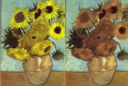
Many artists who doggedly stick to blending green with blue and yellow, are unaware of the fact that very few yellow pigments offered by any of the quality brands are in fact as stable or permanent as they assume them to be. In fact, many yellow pigments in brands across the board can have two distinct problems. There are some that will completely fade away with UV light exposure and then there are many that will change and dull into an earthy brown—a mere hint of its former self. Vincent van Gogh knew this because his famous sunflower pieces changed dramatically in a visibly brown direction while he was still alive. He apparently wrote to his brother about how bitter he was about not being able to afford better pigment.
Among all the transparent yellow pigment offered in watercolour (transparency being preferred by most botanical artists), lightfast choices are surprisingly limited. I wish I could simply tell you to check the American Standards for Material Testing (ASTM) I to V lightfast ratings in the information offered by leading brands. Unfortunately, I cannot, because unlike coloured pencils such as Caran d’Ache Luminence and Derwent Lightfasts that are independently ASTM verified for permanency, very few leading paint manufacturers have taken this informative step.
I discovered this when writing my e-booklets, Going Green and Picking a Palette Booklet for watercolor. Some popular brands offer a lightfast rating of A to D while others will rate the pigment per l to V. However, unless it is a I to V rating specifically per ASTM D5067 (and says so), I don’t rely on it. And don’t confuse ASTM D5067 with ASTM D4326 which is a compulsory toxicity certification for paints sold in the United States.
The bottom line? Trust only your own permanency testing and don’t fall in love with a fugitive.

