Yellow is the most problematic primary pigment. So much so that many botanical artists avoid painting yellow subjects entirely.
It’s problematic for a number of reasons. It’s tough to get yellow to look just right in the layering process because the full colour intensity builds so rapidly that it’s easy to overwork its application. And yellow has such a low value potential that it’s a challenge to pick a partner colour for subtle shadows that do not end up as a dirty mess.
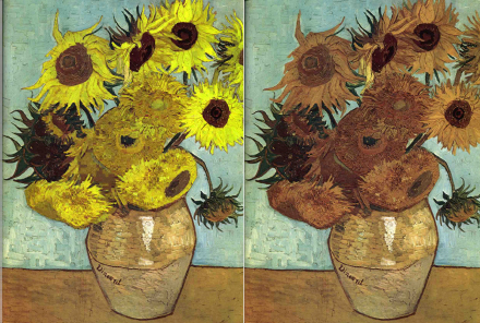
It has always been this way. The impermanency of this pigment has spoiled significant paintings by significant artists by either fading away altogether or turning an ugly brownish version of its former self. For example, the image at the foot of this post tells the tale of Vincent Van Gogh’s sunflowers falling victim to fugitive yellow pigment. See the stark contrast of the browning of the yellow flowers with what they would have looked like right after he painted them.
As most botanical artists take advantage of the benefits of transparent pigments, the selection of a yellow primary option becomes a matter of double trouble. A cool yellow pigment that is both completely transparent and completely permanent is not available.
In my latest e-booklet, Picking a Palette, I address the matter of deceptive use of the ASTM coding relative to lightfastness. The only way artists can be absolutely sure of the lightfastness of a yellow pigment is to do their own testing. For example, I do not use PY40 (often called Aureolin) that some manufacturer’s tubes rate as a ll. Independent testing challenges this rating and considers it to be a lll (Fair) at best. Neither do I use PY150 which is considered lightfast but is a deep ochre in masstone and tends to lean towards a brownish finish in multiple layering.
And so the perfect cool or middle yellow saga rages on. But in the case of a warm yellow I am completely happy with a PY110 pigment often labeled, Indian Yellow.

