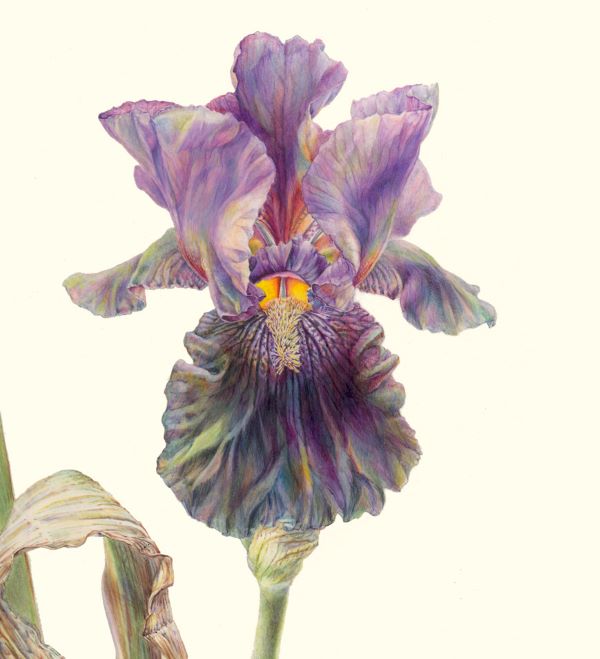
I was planning to offer more commentary about botanical art colours in my next post, though I was still pondering the topic. But that was before Jean Emmons’s presentation at the ASBA’s 27th Annual Meeting and Conference, Online in October.
It was a truly profound presentation—one of the best I have ever watched! It was brilliant. The ASBA is going to make available recordings of the presentations at this conference; for any serious student of botanical art, Jean’s is a must-see.
I’ve often featured her paintings and her hallmark approach to colour in my teaching. They show how one can gently bend what some assume to be the so-called “rules” of colour. It’s subtle, and clever, and it makes me smile. This is particularly true of her handling of highlights and reflected light.
I recall a special moment with Pandora Sellars in her backyard years ago after she questioned the blue colour I had inserted into a highlight on a shiny leaf. I had Jean in mind when I took that somewhat daring step. We went out to Pandora’s old pear tree where the leaves were glimmering in the bright sunlight. Pointing to a leaf, I said, “There you are . . . there’s the blue I see.” She reluctantly conceded that, indeed, she saw it too— the reflection of the sky. Pandora always preferred warmer colours in leaves. I knew that but put the blue there anyway because I was seeing and enjoying it.
We agreed that it was important to respect differences of opinion about botanical art colours. And that is part of what Jean emphasized today—colour interpretation is a very personal matter. The fact is that seldom will you find two successful artists with the same preferred palette.
But what pleased me most of all today, was that despite her playful approach to colour, she believes (as I do), that newcomers to this art form need to engage in some colour theory to broaden their understanding and that nobody is going to be harmed by making colour charts and exploring colour blending. It has been years since I last produced a colour chart, however, I do promote exploration and testing of pigment in order to make informed colour choices. And unlike Jean’s latest venturing into opaque colours on vellum, I use nothing but transparent colours and I do not paint on vellum. But I respect the fact that she creates extraordinary results on this surface with her own masterful style.
After the ASBA’s 2020 conference, Jean wrote me a kind note about my presentation. She told me that what I’d said about the importance of value contrasts and value range, really resonated with her. To use an informal but descriptive British term, I was really chuffed that she had taken the time to let me know that her thoughts were completely in sync with mine regarding what had been a core element of my teaching for years. And today, her presentation made me realize to what extent we are on precisely the same page when it comes to the topic of colour value. She explained it eloquently.
So, it’s thanks to Jean Emmons for memorable moments both this year and last. And it’s thanks too for the permission to allow her beautiful iris to illustrate the personal aspect of colour interpretation.

