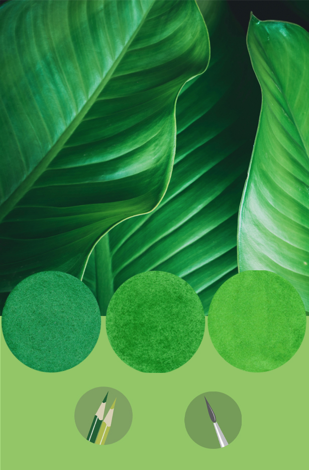
Three years ago, I posted an article about the use of digital versus natural greens in botanical art. Unfortunately, it’s an ongoing issue. Artists who have sourced all their information about a subject from a screen (hand-held devices or computer monitors) are most likely to create unnatural greens—digital greens.
Botanical art is all about an intimate association with a living plant. It’s about deep observation, touching it, viewing it from all angles, and considering all perspectives. This is the only way to draw the details precisely and match the colours accurately. This cannot be achieved with the same degree of excellence if the source is digital or printed.
With that said, digital images can be a useful supplementary guide for certain details after your plant subject has wilted past the stage you are still working on. But that’s different from relying on purely digital imagery rather than upfront colour matching and drawn details to capture the essence of what you have observed in the live specimen. Digital green can undermine the time and skill you devoted to a plant that inspired you to portray it as accurately as possible. And, frankly, your painting will end up admitting to an astute observer that your source was a digital screen or photograph.
As an exhibition juror, I am always concerned about the greens I see in some of the work. Unfortunately, for practical purposes, initial jurying has to be done with digital images. Consequently, one does not wish to prejudice an artist on the basis of a potentially inaccurate scan or distorted digital colours. So, if possible, I attend the exhibition in question to see the work I selected. Invariably I am disappointed every time because some skilled artists have obviously not matched colour from the subject, despite knowing better. It’s so obvious to both experienced observers and discerning buyers.
Every summer (as in the northern hemisphere right now) natural green is all around us with richness, depth and, yes, sometimes a measure of intensity. But there’s no excuse for starting a piece while surrounded by an incredible array of greens at their finest without first matching those colours right away.
When it comes to green, whether working in watercolour or coloured pencil, there is a list of colours to either avoid completely or learn how to tame effectively. The main culprits are the permanent pigments PG7 and PG36 of the Phthalo family of pigment colour. One has a blue bias and the other leans towards yellow. In coloured pencil, Faber Castell still leads the way with natural green offerings but avoid Grass Green as it is garish and will destroy the natural feel of your work. Be aware that every brand has unnatural colours to avoid.
My e-booklets Going Green (for either watercolour or coloured pencil) will guide you to the best options for colour matching green. My Going Green workshops, always offered in summer, are an excellent way to acquaint yourself with hands-on exploration of producing natural-looking green. It’s one of my favourite classes to teach as many artists have told me it was a game changer for them.

