Isn’t it ironic that the prevalent colour in the plant world is also the toughest for many botanical artists to capture accurately in their paintings?
As more and more artists rely on digital devices nowadays, this struggle for a natural-looking interpretation of green has only become tougher. We now have a whole new green problem; I call it “digital green.” It’s a visibly garish and strikingly artificial green.
The Oxford Dictionary defines “garish” as “very brightly coloured in an unpleasant way.” And that is exactly what “digital green” is—most “unpleasant.” Webster takes their definition of “garish” a step further with three descriptions that convey my opinion of the garishness of “digital green” very well: “disturbingly vivid”, “offensively or distressingly bright”, and “tastelessly showy.” Vivid descriptions, but for me as a committed teacher in this art form, they describe perfectly digitally-sourced green colours. These digital greens are simply unacceptable in botanical art.
I have taught many workshops on making natural greens for nearly seventeen years across Canada, the USA, Bermuda, and the UK. If you ever attended one of those workshops you’ll recall that I borrowed the title from Kermit the Frog and called it, “It’s Not Easy Making Green.” But now as fewer artists may know Kermit and to have greater global appeal, I call it Going Green.
I am particularly proud of my latest series of e-booklets titled Going Green that offer practical solutions for both watercolourists and coloured pencils artists in accurately matching green. They are as up-to-date as you will find anywhere at the moment. I assess the latest and best materials available and also provide specific warnings on colours offered in art supply stores that will take you down the slippery slope to a “digital green” swamp. This is especially likely to happen if you have no idea how to “tame” them.
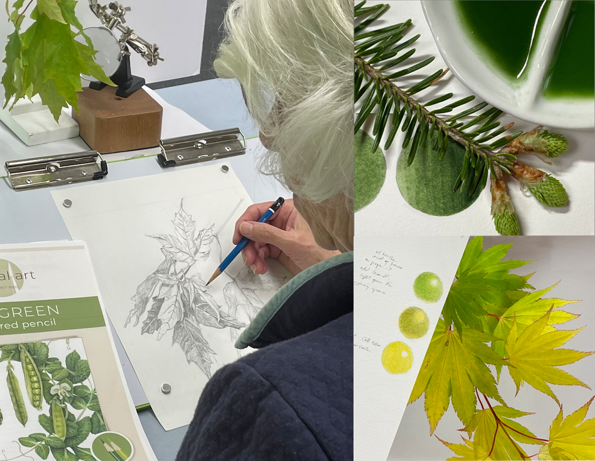
It saddens me to see images of artists busy in workshops with only screens in front of them and without a single specimen in sight. It suggests that some educators in this genre are not as informed or caring as they should be about the fundamental concepts of botanical art, one of which is working with live specimens. The image I’ve included from one of my workshops shows how it needs to be for both drawing and colour matching.
Unfortunately, the curse of “digital green” has infected some contemporary juried exhibitions recently too. Jurors seem increasingly reluctant to eliminate a painting that displays remarkable technical competence but enough “digital green” to evoke the distaste of a more discriminating audience. Perhaps the guidelines for exhibition jurors need to specifically outlaw “digital green” or perhaps the jurors simply need to take action themselves.
It’s time to take a stand on this for the sake of the traditions and authenticity of the genre.

